Raynsie
Branding and look & feel for Raynsie,
Amsterdam-based performance rain gear.
Creative Direction & Branding Design.


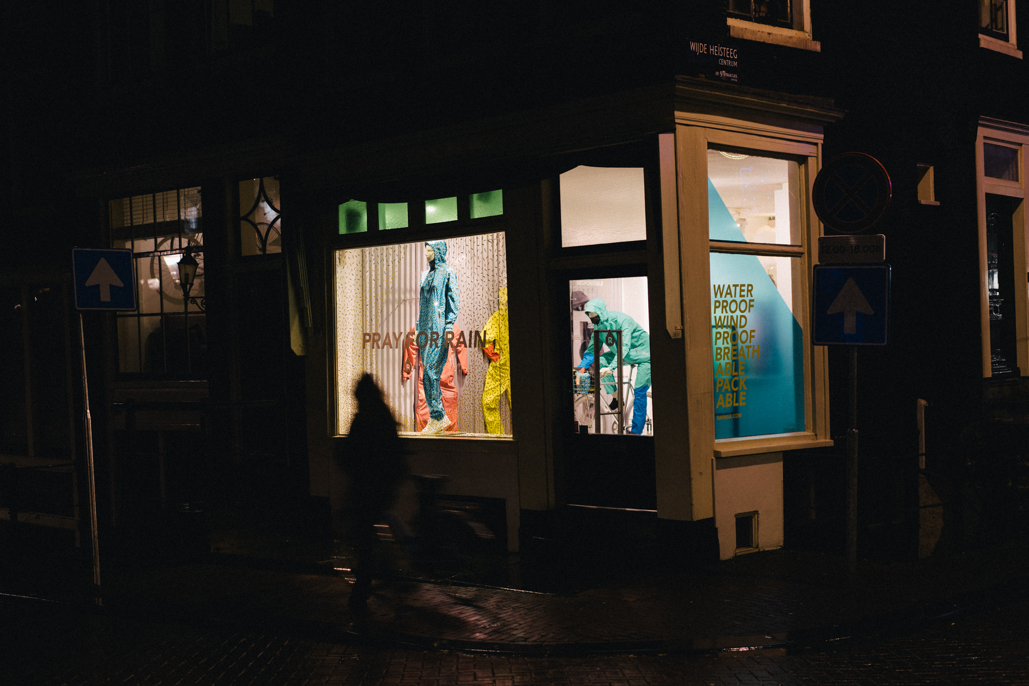
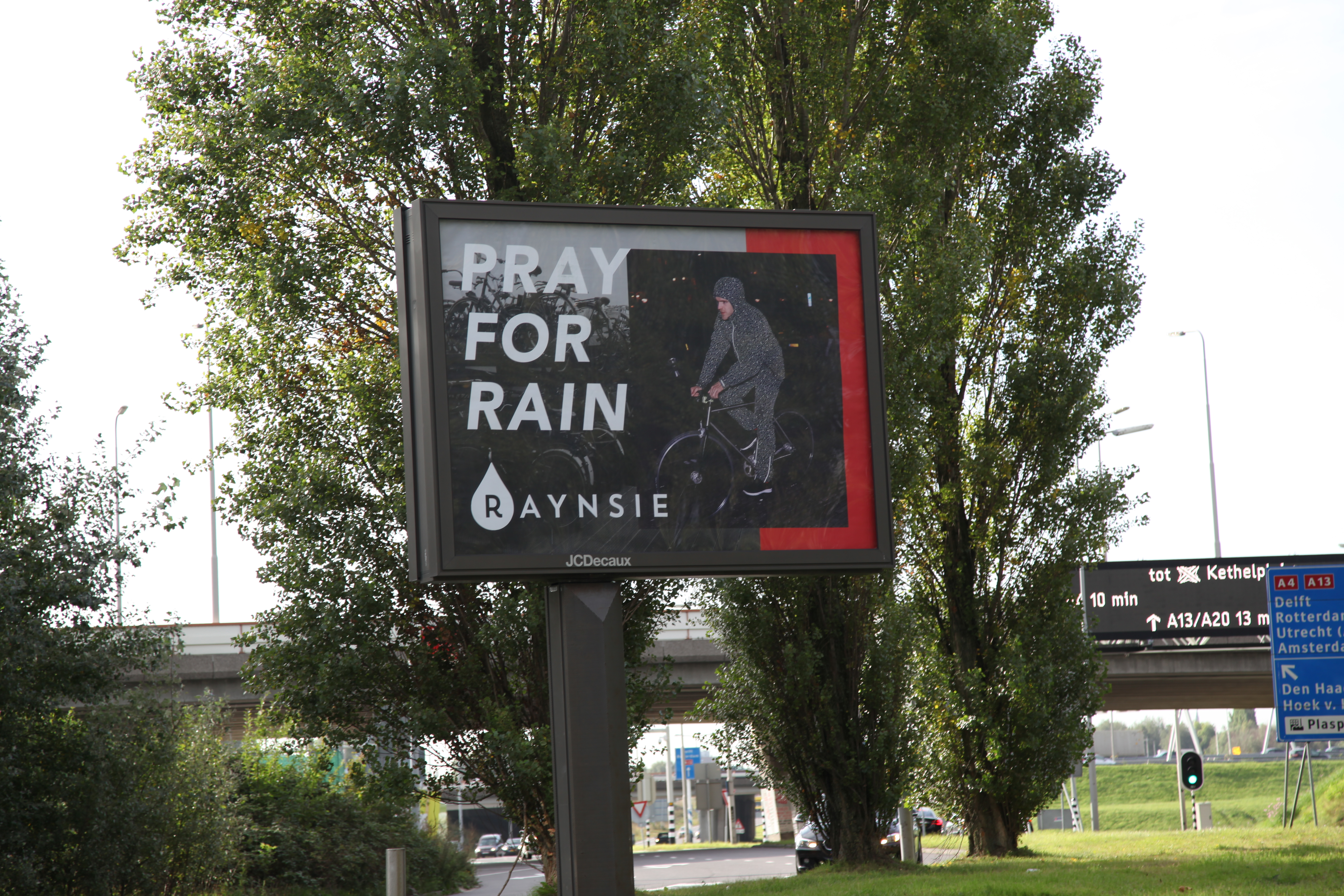
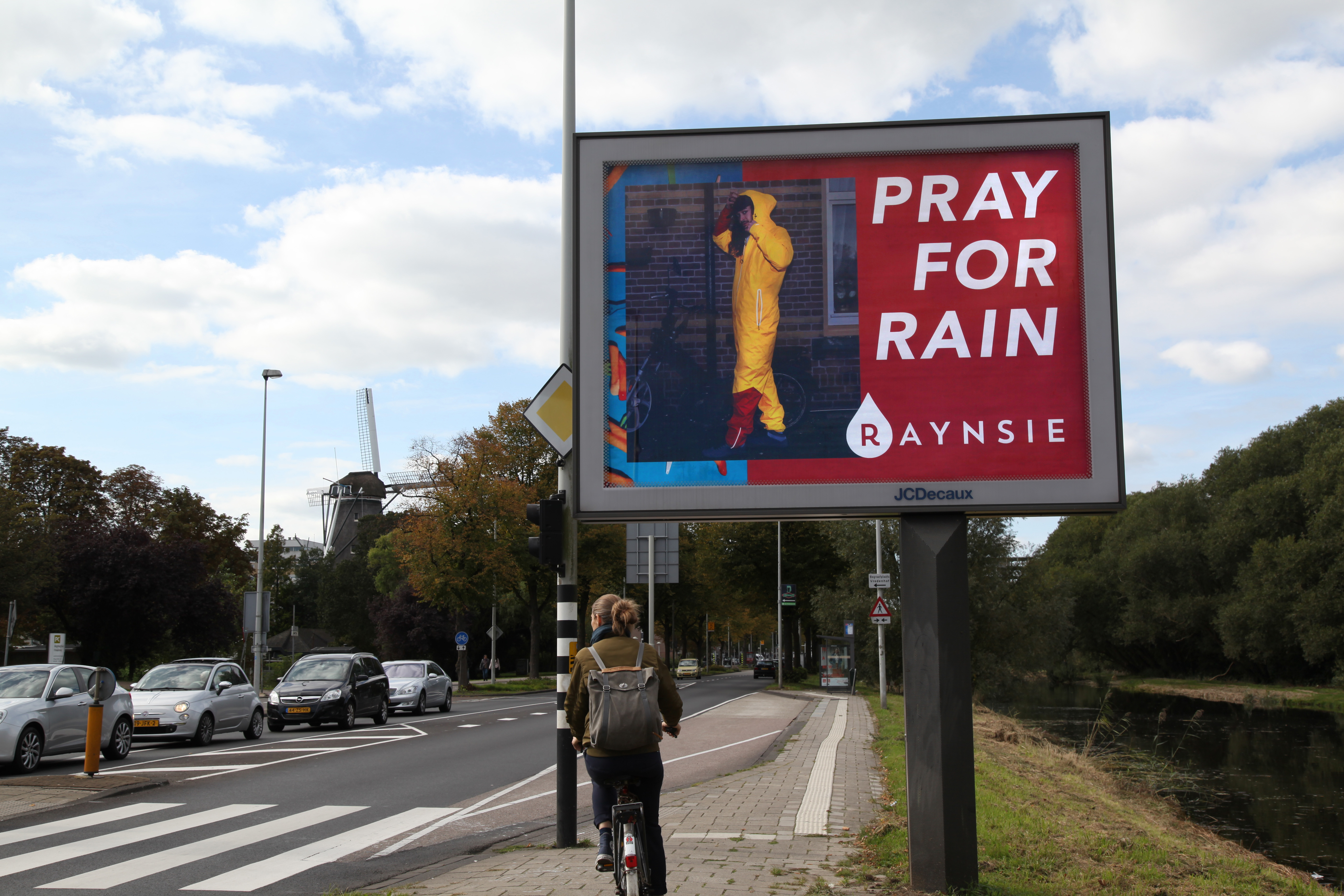
Raynsie branding embodies the spirit of it’s conception, no nonsense, not too serious, laughing, loud and born in Amsterdam. Pray for rain.
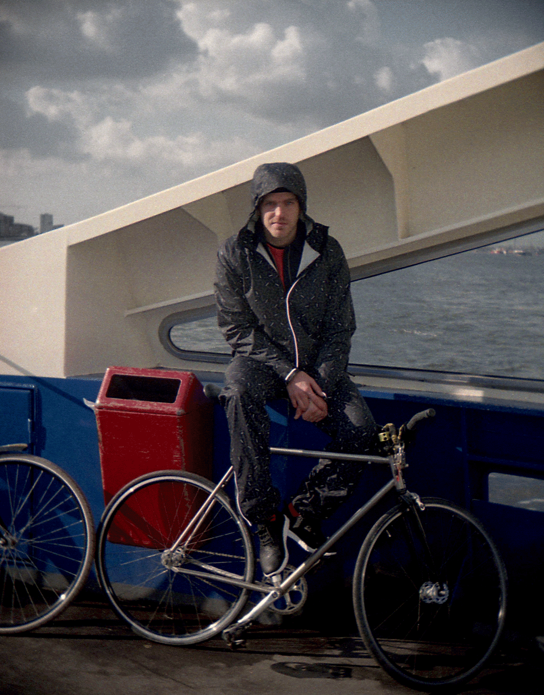
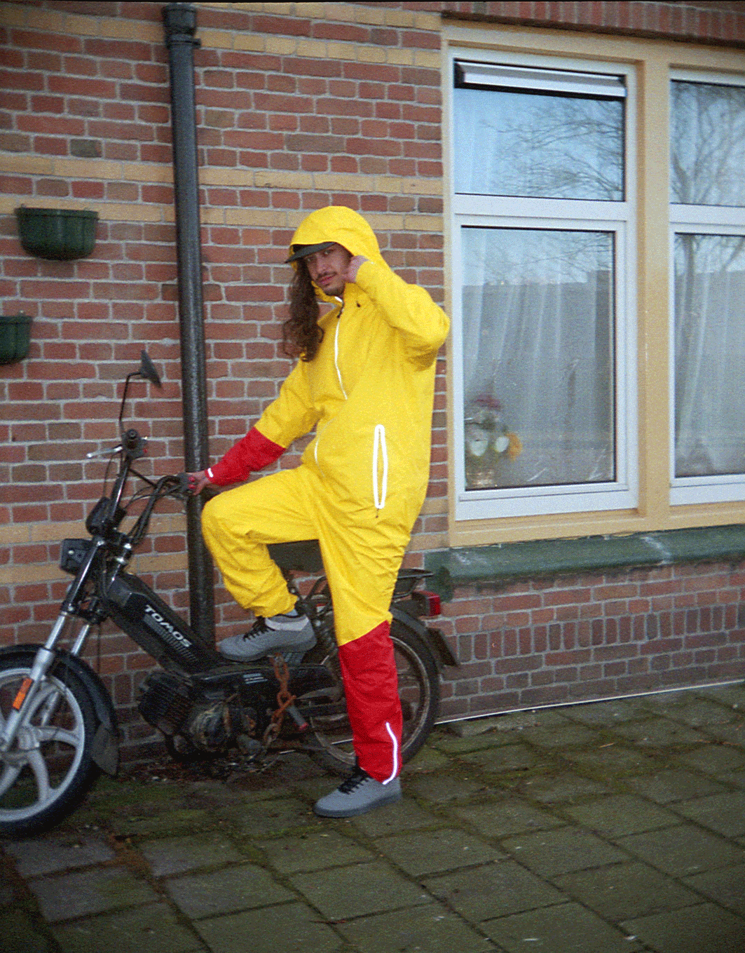
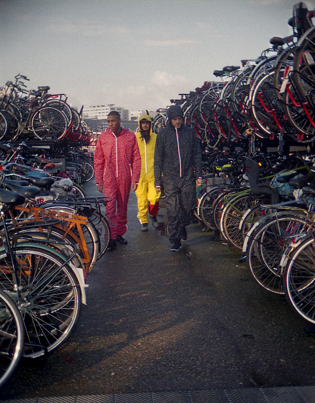
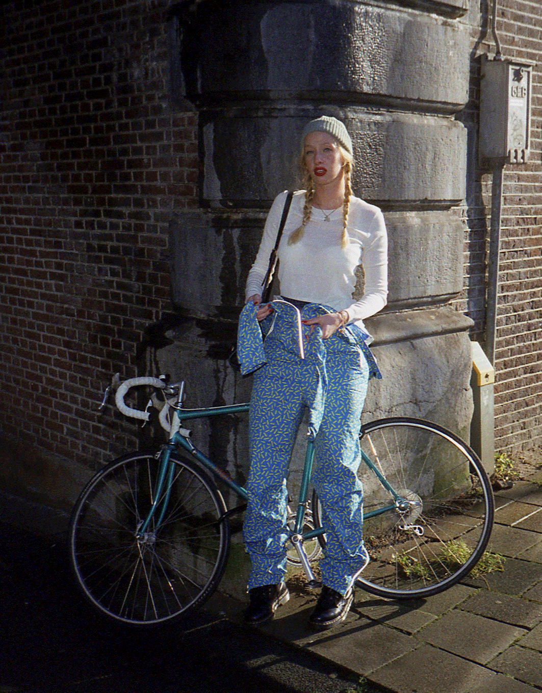
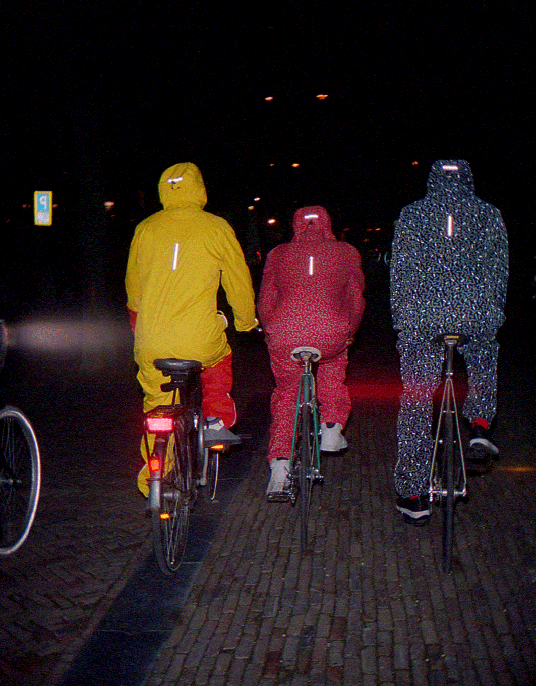
Working with local photographer Elza Jo, we developed a styling that was fun and fresh yet authentic to the city. The shoot shows Raynsie wearers out and about getting on with their shit.
![]()
![]()
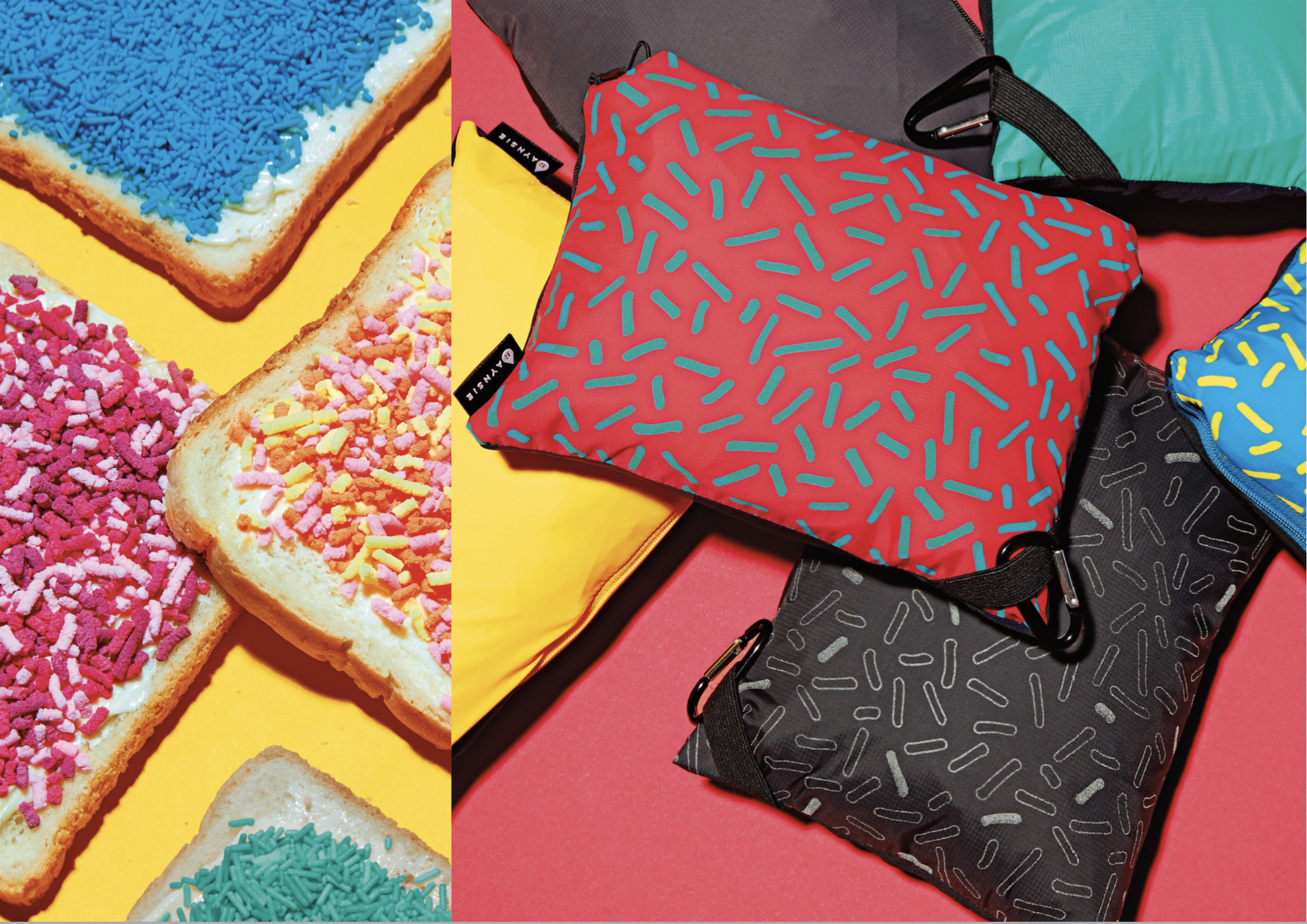
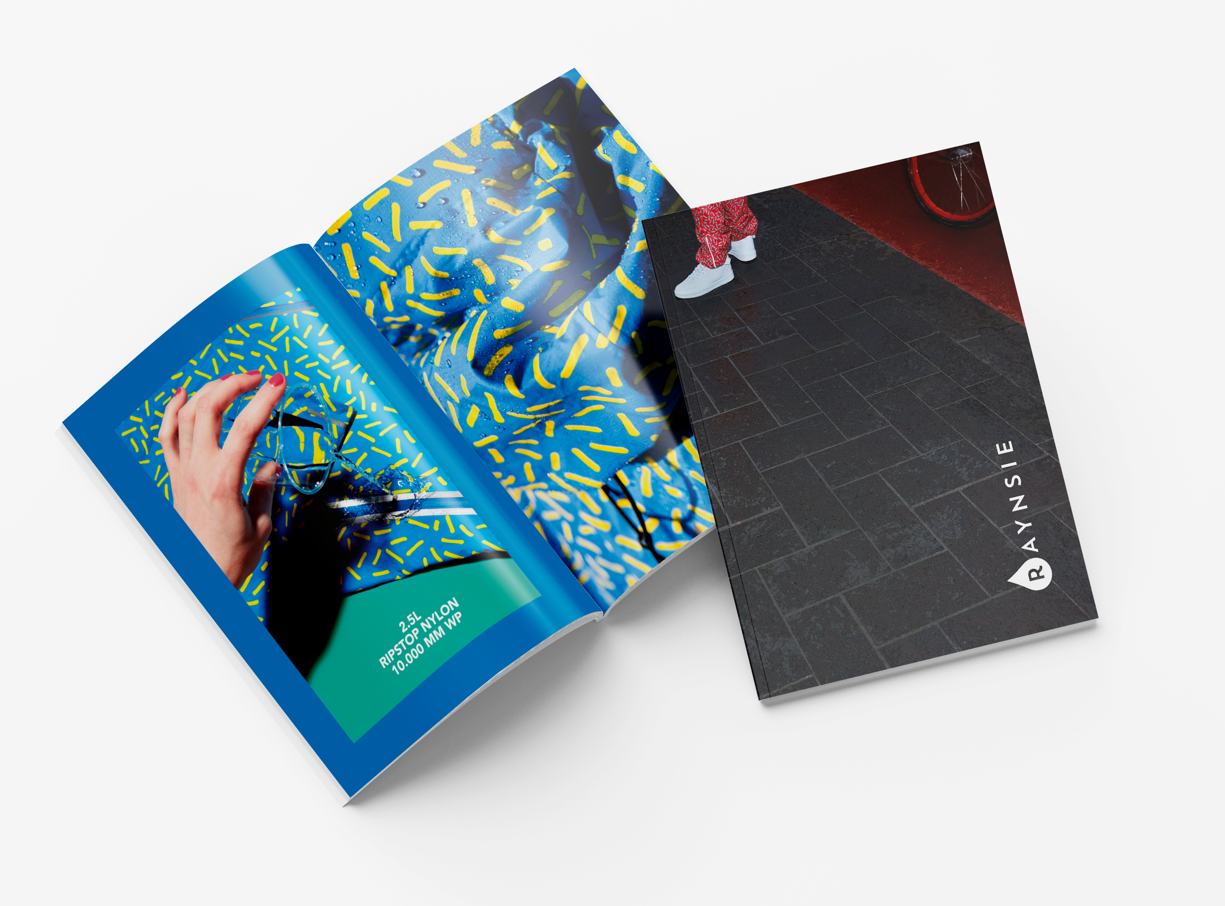
Complementary assets styled in the studio referenced the Dutch pattern inspiration of dipped fries and hagelslag sprinkles.
Shot on bright colours and used clashed together in brand communications, they create a world for Raynise that stands out from the other grey, melancholic rainwear brands.
The Raynsie mission is to bring the bold and joyful Amsterdam attitude towards the elements and urban life to cities around the world. We developed a tone of voice that reflects this; it’s straight-forward with a strong attitude and a whack sense of humor.
![]()
Shot on bright colours and used clashed together in brand communications, they create a world for Raynise that stands out from the other grey, melancholic rainwear brands.
The Raynsie mission is to bring the bold and joyful Amsterdam attitude towards the elements and urban life to cities around the world. We developed a tone of voice that reflects this; it’s straight-forward with a strong attitude and a whack sense of humor.


Raynsie is proud, positive, never defeated with no compromises on style, personality, quality and weather conditions. Rain doesn’t mean sadness or melancholy. Rain is life, face it with a bold smile.
Logo evolutions were based on various water droplets. The result was a playful flexible raindrop mark combined with a sturdy and reliable word mark logo & droplet icon.


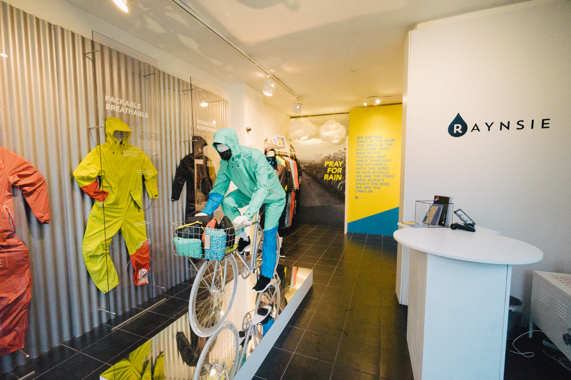
The branding was rolled out across the website and successful launch events in Amsterdam and London.
![]()
![]()
![]()
![]()
![]()